CREATIVE DIRECTION
VISUAL IDENTITY SYSTEM
BRAND EXPANSION
GRAPHIC DESIGN
INFORMATION ARCHITECTURE
CONTENT STRATEGY
COPY EDITING
WEB DEVELOPMENT
MOTION DESIGN + INTERACTIONS
VISUAL IDENTITY SYSTEM
BRAND EXPANSION
GRAPHIC DESIGN
INFORMATION ARCHITECTURE
CONTENT STRATEGY
COPY EDITING
WEB DEVELOPMENT
MOTION DESIGN + INTERACTIONS
Stephen Gaynor School, a K–8 independent school in New York City serving students with learning differences, partnered with MAVE to reimagine a digital experience that matched the energy of its community. As the school evolved, its website had become increasingly difficult to navigate, visually fragmented, and less reflective of the warmth and excellence found throughout campus. We redesigned the experience from the ground up, centering accessibility, elevating storytelling, streamlining the user journey, and building a flexible visual system that can evolve alongside the school for years to come.
This project was executed at MAVE Studio.
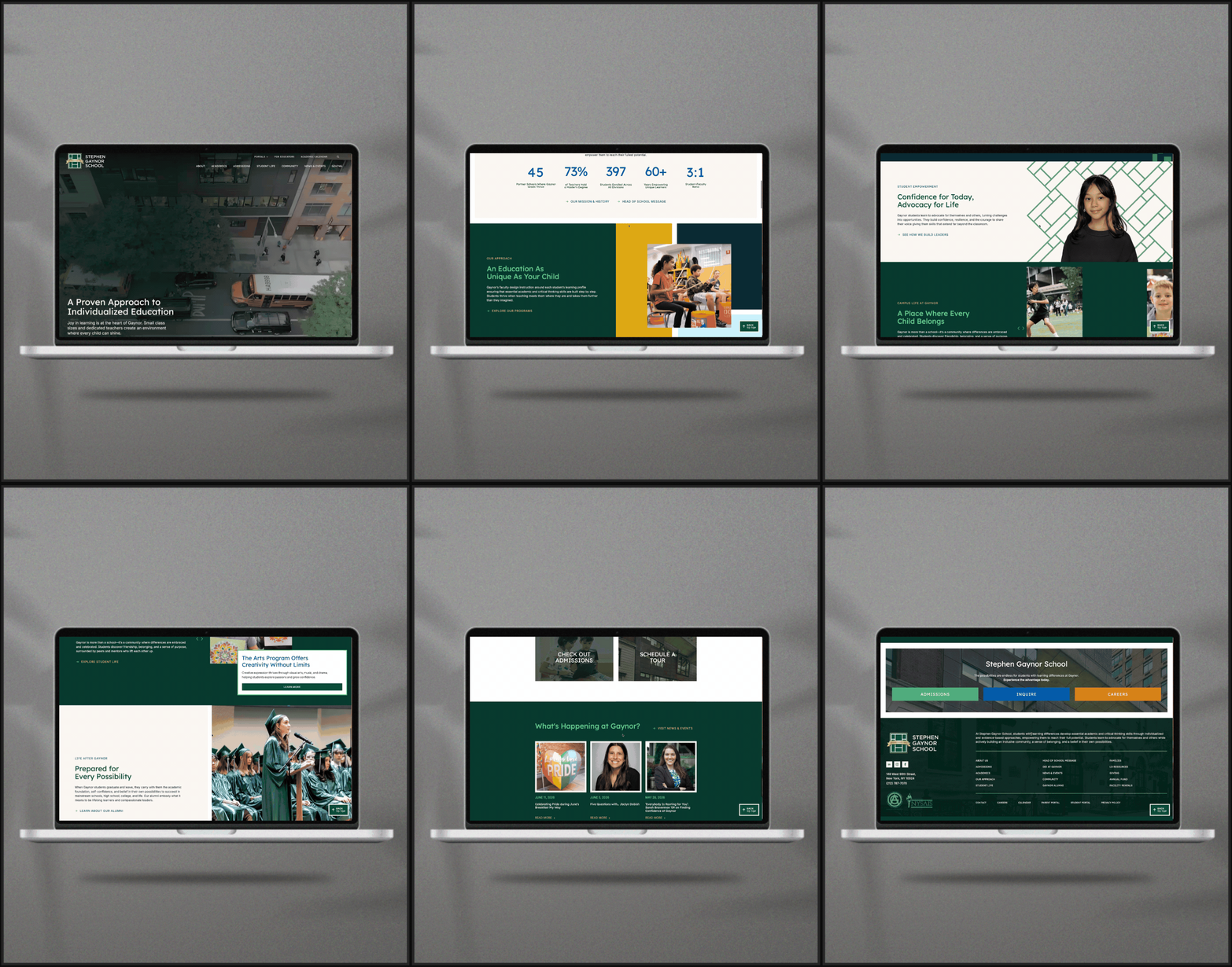
The project began with a complete reevaluation of the site’s structure and user journeys. With nearly 70 pages of sprawling and often redundant content, we streamlined the information architecture into a clearer, more connected experience designed to better support prospective families, current parents, educators, and donors alike. New portal-style landing pages, simplified navigation, and a stronger typographic hierarchy transformed dense informational content into something far more approachable, engaging, and easy to explore.
Beyond the visual redesign, the project focused on creating a more sustainable editorial ecosystem for the future. We migrated the site to a new theme framework that empowered the Gaynor team to confidently build, edit, and expand pages internally while maintaining a cohesive visual language. Enhanced analytics, professional SEO tools, and improved site tracking provide deeper insight into user behavior and establish a stronger foundation for continued growth.
Beyond the visual redesign, the project focused on creating a more sustainable editorial ecosystem for the future. We migrated the site to a new theme framework that empowered the Gaynor team to confidently build, edit, and expand pages internally while maintaining a cohesive visual language. Enhanced analytics, professional SEO tools, and improved site tracking provide deeper insight into user behavior and establish a stronger foundation for continued growth.
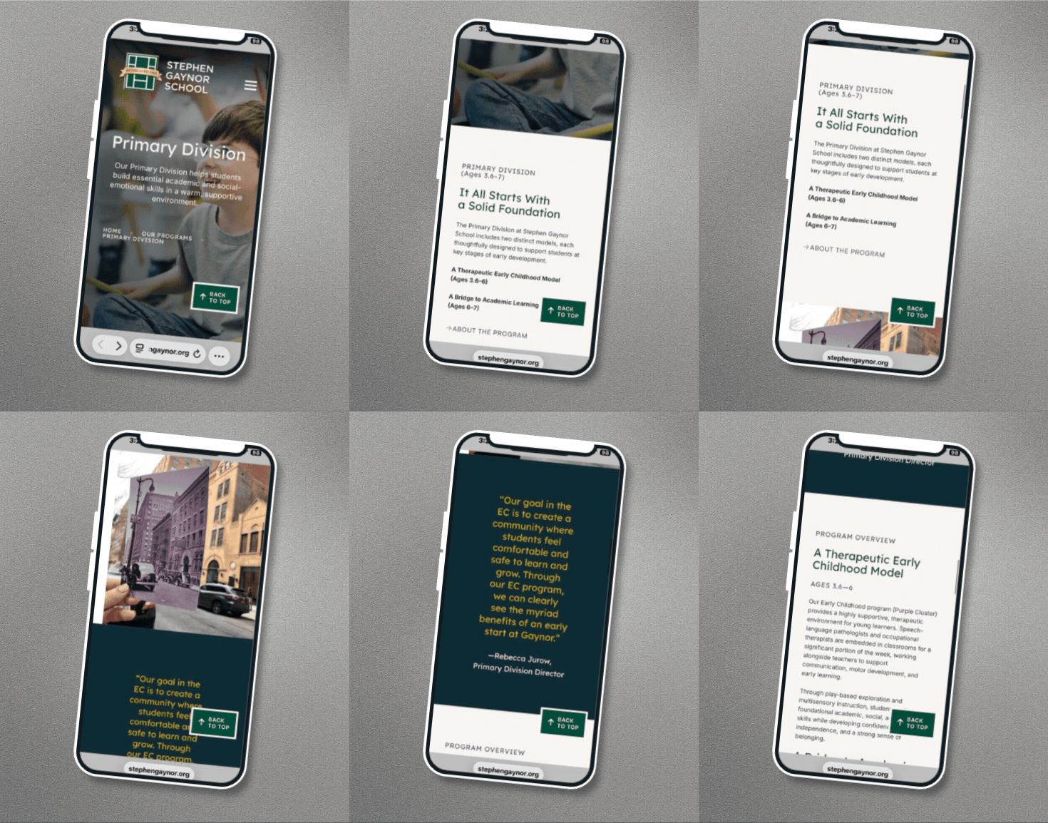
With the majority of prospective families discovering schools on mobile devices, the experience was designed mobile-first from the outset. Navigation, content hierarchy, and interactive elements were carefully refined to ensure the same sense of warmth, clarity, and visual impact translated seamlessly to smaller screens. From immersive video and expressive photography to streamlined menus and touch-friendly layouts, the mobile experience feels every bit as intentional, accessible, and engaging as its desktop counterpart.


A major opportunity within the project was expanding Gaynor’s existing visual identity into a more expressive and scalable design system. The school’s logo, inspired by the iconic library windows, became the conceptual foundation for a new visual language built from patchwork color blocks, cropped grid graphics, and modular framing devices that feel like close-up extensions of the mark itself.
These elements appear throughout the site as layered backgrounds, image frames, and connective visual moments, creating continuity across the experience while reinforcing the school’s themes of connection, collaboration, and support. Thick white borders and intersecting graphic panels give layouts an architectural quality that feels both playful and purposeful, allowing the identity to flex while remaining unmistakably Gaynor.
These elements appear throughout the site as layered backgrounds, image frames, and connective visual moments, creating continuity across the experience while reinforcing the school’s themes of connection, collaboration, and support. Thick white borders and intersecting graphic panels give layouts an architectural quality that feels both playful and purposeful, allowing the identity to flex while remaining unmistakably Gaynor.
Accessibility was foundational to the redesign from the very beginning. Extensive contrast testing informed the expanded color palette, while the implementation of the dyslexia-friendly typeface Lexend, improved typographic hierarchy, and thoughtful readability standards ensured the experience remained both vibrant and inclusive. Every design decision was made with diverse learning needs in mind, creating a site that reflects Gaynor’s mission through the way it communicates as much as the information it provides.

The final product was a contemporary, accessible, and visually cohesive platform that positions Stephen Gaynor School not simply as a school for students with learning differences, but as a leader in how those students are empowered to thrive. More than an admissions website, it is a flexible storytelling platform that strengthens the school’s brand, supports its evolving community, and gives its team the tools to confidently grow and manage the experience for years to come.